When the Russo-Ukrainian war kicked off back in February, I relied on https://liveuamap.com/ to track military action in the war, just as I had used their similar map when tracking the war against the Islamic State. However, after the initial phase of the war, LiveUAMap seemed to update less and less frequently, and it’s been practically useless for tracking progress in the Kherson counteroffensive.
Today, most video commentators on the war seem to rely on https://deepstatemap.live. Here’s today’s snapshot from Kherson:
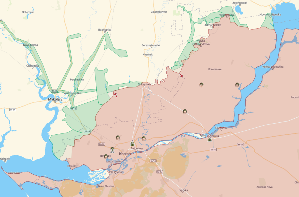
Better than nothing, but not as good as LiveUAMap used to be.
Here YouTuber Suchomimus compares different maps of the Kherson offensive, and how the differ on territory captured.
He mentions the War_Mapper Twitter account, which I haven’t been following due to my ongoing Twitter timeout.
Updates:
🇺🇦 have entered the settlement of Arkhanhelske, which is now contested.
🇺🇦 advanced from the Inhulets bridgehead, capturing Sukhyi Stavok and continuing to the outskirts of Kostromka and Brushkyns’ke, briefly cutting the supply route to Davydiv Brid. pic.twitter.com/x1ZiAg4Pig
— Ukraine War Map (@War_Mapper) September 1, 2022
He also mentions the official Russian-sourced map, which I’m not particularly interested in trusting.
The Institute for the Study of War includes a map with their daily assessment updates, but they’re not interactive or particularly detailed.
There are also a few YouTubers who do daily map updates. There’s Denys Davydov (“Hello, my friends…”). He’s Ukrainian and upfront about his bias, and covers the various clashes across the entire front (which makes his videos a bit long, and I tend to skip around for the bits I’m interested in). He suffers from “The map is the territory” syndrome, and isn’t a deep tactical thinker or versed in the intricacies of combined arms operations, but he’s useful if you understand his limitations.
One of the maps he relies on (in addition to DeepState) is the MilitaryLand map, which looks really useful.
Ukraine News TV relies on the DeepState map, and goes into considerable detail recount the day’s events.
War in Ukraine isn’t great in terms of voiceover, but seem to have a lot of unit-specific information on his maps.
For the sake of completeness, I note WeebUnion, who says he’s objective but seems pro-Russian (and his commenters even more so). He’s not a dynamic voiceover talent, and he begins this video with “Hello, comrades,” so…yeah, I don’t follow him.
This is the map he’s using.
This is a quick rundown of the map resources I’ve run across. If you know of other useful source, feel free to share them in the comments below.
Tags: Denys Davydov, Foreign Policy, maps, Military, Russia, Russo-Ukrainian War, Suchomimus, Ukraine, video
See, here’s the problem with a lot of this stuff. The military (every military, everywhere at every time in history…) uses maps to try to grasp the outlines of what’s going on in whatever conflict they’re engaged in.
They’re useful tools, these military situation maps. They are. But… The problem is, the friggin’ idiots who think the maps represent anything other than a timeslice and what amounts to a belief system about what is going on that’s virtually borderline delusional.
The real deal is that what’s happening out on the ground has to be reported up the comms chain, disseminated to the various staff sections concerned, interpreted, verified, and then finally getting posted hours (if you’re lucky; if you’re not, days-weeks-months…) on the map boards at the front of the Tactical Operations Center that everyone is using.
There is no damn way any of that crap is at all accurate, or representational of anything other than someone’s fantasy about what’s going on, what the commander is hoping is happening, and all the rest of the attendant factors.
Working in a TOC for all the years I did, from company up to division and corps, I’m here to tell you that the maps they use are usually more representational of aspirational hopes than actual reality. It’s a fact of unfortunate life, even with technological aids and good reporting.
The reality is what it is, down on the ground. That’s why it is key and critical that the commander actually gets out and sees for himself what is going on, because all those pretty-pretty maps and overlays in his headquarters? They’re mostly the product of some really outrageous assumptions that may or may not actually represent reality. You don’t know what you don’t know, until you get out and check. When I was an O/C at the NTC, that was one of the major checks we’d make on commanders at all levels: How good was the fidelity between what they were tracking in the TOC vs. what was actually out on the ground. And, I’m here to tell you, when you compared what was on the actual maps you would get from the TAF (Tactical Analysis Facility, where they processed all the information from the sensors out on the vehicles and battlefield), the results were often brutally wrong.
Which can have some really odd effects; I know of at least one (simulated) battle engagement wherein the commander’s delusions about what the state of things was actually led to him winning the engagement with orders that would have been suicidal if he’d a.) known the actual situation and b.) given the exact same order, adjusted to that reality. As it was, the orders he issued resulted in OPFOR getting taken (literally…) up the ass-end of their formation, which totally dislocated the whole attack they were almost certain to win.
Tactical situation maps are really only as good as the elements making them, and are rarely even remotely accurate. They’re aspirational tools, more than anything else, and trying to read them can sometimes be as useful as doing a Tarot reading or consulting a Ouija board.
You could try “The Enforcer” on You Tube, w/c has a daily live update on the Ukraine war. He, however, relies more on the video of that war and has a question/answer portion in w/c he answers the questions of his viewers as accurately as he can.
Institute for the Study of War does have an interactive map at their web site.
https://storymaps.arcgis.com/stories/36a7f6a6f5a9448496de641cf64bd375